Expérience utilisateur dans le ecommerce : un audit UX des boutiques en ligne de Zara et Nike


Nowadays, UX (user experience), plays a crucial role in designing and creating ecommerce solutions. Online stores want to achieve the highest possible traffic and conversion rates, which translates directly to high profits. To achieve that, you need to ensure that your website is as intuitive and comfortable as possible.
Cette approche rendra le processus d'achat plus efficace et plus agréable pour les clients. Cependant, pour y parvenir, vous avez besoin d'une couche UX et UI bien préparée de la boutique, qui permettra également de améliorer la conversion et renforcer l'expérience utilisateur positive. Pour s'assurer que les solutions mises en œuvre sur le site web du magasin sont bien conçues et pratiques pour les utilisateurs, il vaut la peine de réaliser un audit UX, au moins occasionnellement.
Ci-dessous, nous explorons les avantages d'une telle analyse et présentons les résultats issus des audits de deux boutiques en ligne exemplaires.
Principes UX pour le e-commerce en lien avec le comportement des utilisateurs
Research clearly states that customers give up shopping and leave ecommerce websites that give them a negative impression – for example when they “get lost” or have to think too long about where they should click to search or buy a given product. Sometimes, the information presented on the main page or in the category tree can confuse users. This means that they can jump to the wrong conclusions and leave the site with the conviction that there’s nothing there for them. There is quite a lot of research on this subject, so you can rely on already-proven knowledge. This makes it easier to conduct an effective UX audit of your own store and streamlines the process of designing a new layout that meets your customers’ needs.
A perfect home page should contain key information such as the offer of a given store, a visual representation of the main categories, as well as photographs showing the available products in a broader context. All the places with inspirations, product categories, and additional tools for finding gifts or choosing sizes placed on the home page also work very well when it comes to guiding customers through the subsequent steps of the purchasing process.
Elements such as carousels with banners also need to be designed with users in mind – they cannot slide too fast and should stop when the user hovers the cursor over the selected slide. On the other hand, showing pop-ups or other similar intrusive advertising banners won’t help to win customers, so you should always be careful with assets like that.
The business success also depends heavily on the taxonomy and construction of the category tree on the website. Navigation must be intuitive; it should leave no doubt as to where the user can find the products they need. Granted, achieving this is not always easy, especially in the case of stores offering a wide range of different products. However, devoting more time to creating a good category plan before implementing it can be extremely profitable. After all, a customers’ willingness to browse the store’s product catalogue is on the line.
To introduce the most important issues for consideration during a UX audit, we have conducted an analysis of the main pages and product categories of two popular brands: Zara and Nike. The whole piece was prepared with the help of user experience research tools created by Baymard Institute.
Audit UX : ZARA
Page d'accueil et mise en page
✓ The current homepage of Zara is built entirely on carousels (both vertical and horizontal). The latter serves as a visual representation for almost the entire offer (as much as 85% of the most important categories from the main menu). This is a very good result because many users visiting the online store for the first time evaluate the offer based on the home page. Therefore, its diversity should be showcased visually, by clearly showing the main product categories.
❌ However, if we look closely at the implementation of vertical sliders, things get a bit worse. Slides that are not videos scroll automatically every 4 seconds. In the desktop version, they do not stop when hovering over them with the cursor. What’s more, the navigation from the slider disappears and appears only when the customer is using the mouse scroll. Only clicking on the slider control (provided you manage to do it before it disappears) stops the slideshow. The carousel controls also disappear on the mobile version of Zara’s website. And even when they are visible, it’s difficult to find them, thus clicking often redirects the user to the page to which the current slide is linked. According to UX research, carousels should not dominate the store’s home page (static content should play the main role). The carousels used on the page should have easily accessible controls, and they should stop when you hover the cursor over them.
✓ Côté positif, il n'y a ni bannières ni pop-ups qui peuvent être perçus négativement par la plupart des utilisateurs.
✓ Les produits sur la page d'accueil sont présentés dans des contextes spécifiques, ce qui permet à l'utilisateur d'imaginer plus facilement le port des vêtements et autres articles proposés par Zara.
✓ Le logo est placé dans l'en-tête et il conduit l'utilisateur à la page d'accueil – c'est une très bonne pratique UX.
✓ Another positive is that Zara does not require the user to log in to browse the product catalogue. What’s more, both the footer and the header contain links to all the relevant information, which is visually distinguished and grouped semantically. There are no chat boxes and pop-ups jumping out on the page, and it’s hard to find specific UI missteps.
❌ Zara uses geolocation to determine users’ location and does not allow them to change it themselves. According to the research, this is not a good practice because the client should be able to make changes as needed. It is also important to place the location switch in the header of the page so that it is always easily accessible to the user.
❌ Les textes ajoutés aux photos sont souvent illisibles (par exemple, un menu bleu dans une photo bleue), ce qui rend la lecture difficile.
❌ L'analyse des performances de chargement de la page a donné un score moyen :
Largest Contentful Paint (LCP) = 3,8 secondes
Dans l'ensemble, la page principale et la mise en page de Zara ne sont pas trop mauvaises, mais il y a certainement une marge d'amélioration. Le site est plutôt transparent, de sorte qu'en le consultant, les utilisateurs peuvent rapidement évaluer s'ils trouveront quelque chose qui leur convient.
Sous-pages et catégorisation des produits
En ce qui concerne l'arborescence des catégories sur la boutique en ligne de Zara, l'évaluation globale n'est pas très bonne.
❌ To begin with, products with specific types should have assigned attributes that can be filtered instead of creating separate subcategories. On Zara’s website, it’s exactly the opposite. This is not a good practice – it artificially narrows down the search field so that the user loses the opportunity to look at similar products that could be interesting to them. This also results in another malpractice on the company’s website, namely, the main categories have too many subcategories (over 14 in this case). A better idea would be to break down the main categories into smaller, easy-to-read sections. This concept, in turn, leads to another, also an unfavourable solution – Zara’s menu lacks a visual division into subcategories. Looking at the brand offer, the store should decide to implement a third level of product categories (instead of only two existing ones). Importantly, this level exists but is not visible in the main menu of the store. Only after switching to a given subcategory can users discover that Zara’s offer includes, for example, high-rise jeans, medium-rise jeans, skinny jeans, or straight jeans.
❌ Another good UX practice is to showcase the menu items graphically, after which the next level of subcategories should go. The page in the ‘Kids’ category has a three-level division of categories. However, no visual indicator suggests that clicking on individual subcategories will give more options. This solution is also not consistent with other categories on the website.
❌ The main categories in the menu should be clickable. Clicking such a link should take the user to a page with visually showcased subcategories. Another idea is to display a product list with all the items in that category. The latter option is reasonable when the main categories in the menu do not have the subcategory named ‘all products’. On Zara’s website, the categories in the menu open the list with all the products and then with the subcategories that are possible to view only with the next menu. However, it’s not obvious that this option exists because there is no information about it in the main menu.
❌ Zara utilise un jargon sectoriel dans son menu, ce qui peut être difficile à comprendre pour de nombreux utilisateurs. À titre d'exemple, voyez les catégories « Zara origins » ou « Zara SRPLS », qui semblent mystérieuses, en particulier pour les personnes peu familières avec l'offre de la marque.
❌ In the category tree, you can find many options that are based on product subtypes. For example, there’s a division of categories into jackets, down and insulated jackets, and shirt jackets. However, it is recommended that product subtypes with specific attributes be implemented as product filters and not as separate subcategories. Moreover, a link to such a category should be shown in the menu, and then a page with all the products within a given category should be displayed, along with attributes. When this is used, users can see a wider range of goods and use the filters that interest them to narrow down the search area. Otherwise, they may miss something they are looking for and lose the opportunity to discover more potentially interesting products. The same rule should apply to the ‘New’ or ‘Sale’ attributes.
❌ Il est également recommandé de créer ce que l'on appelle des pages intermédiaires, où la catégorie parente n'affiche que des représentations graphiques des sous-catégories qu'elle contient. Cela fait défaut sur le site web de Zara.
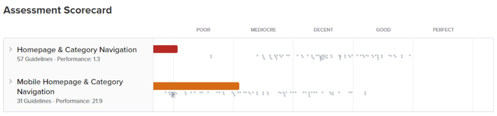
Audit UX de Zara : synthèse
Zara is not an example of a well-designed website. When browsing it, you can easily get lost. The site is very modern and fancy, but it lacks usability. The category tree is built incorrectly and inconsistently, missing a lot of information that can be discovered only on the pages of individual categories. It’s easy to get lost on the site, and it’s hard to find what you’re looking for. In addition, the brand does not use solutions that lead the customer by hand like guides, or thematic articles, and the category page is not very intuitive.
Audit UX : NIKE
Lisibilité de la page d'accueil
✓ Nike’s website is mostly built of static content. This is a very good practice because it makes browsing the website much easier. There are also product carousels, but they do not dominate the content on the page. Slides are not automatically scrolled, which makes them much easier to view. In the desktop version, carousel controls are easily visible.
❌ Malheureusement, ce n'est pas ce que nous constatons dans la version mobile. Bien que le carrousel puisse être manipulé en balayant vers la gauche ou la droite, les commandes de navigation devraient tout de même être clairement visibles et accessibles.
✓ Pas moins de 80 % des principales catégories sont représentées visuellement sur la page d'accueil. Ainsi, il est plus facile pour l'utilisateur de déterminer s'il trouvera les produits qu'il recherche sur le site web.
❌ There are links suggesting moving to specific categories, and they are leading to categories with a predefined, narrowed promotional filter. For the average user, this can be confusing, and for some, it can make it impossible to find the items they are looking for.
✓ L'absence de bannières et de fenêtres pop-up intrusives rend la consultation du site beaucoup plus agréable.
✓ The Nike home page is rich in photos, but the products are mostly showcased out of context and shown against a uniform (although expressive) background. The research shows that it is better to show products in a relevant context. This approach communicates the functionality and suitability of the products.
✓ Les utilisateurs peuvent naviguer sur le site web sans avoir besoin de créer un compte.
❌ Nike uses geolocation to determine their users’ location, but not in a clear and obvious way. To change the location, the user needs to scroll down to the bottom of the page and find the location pin in the footer (it’s easy to overlook it). In situations where the user enters the website, e.g., from Germany, using the Polish language version of the browser – the website displays a pop-up asking to select a language. As research shows – such pop-ups can be discouraging because it is easy to confuse the user when those are used for ads and newsletter subscriptions. UX research shows that when automatic geolocation is not possible, it is best to display a full page that forces you to select the appropriate location. In addition, the location change function should be placed in the upper right-hand corner of the page.
✓ The header is intuitive and legible, and the main menu is in the middle. Moreover, the product search engine that offers hints to help users find the right products, is transparent and quick. Also, the logo is clickable and directs users back to the home page – which is a good UX practice.
❌ Moving to a given category page is not visually marked in the menu, which means that the user may feel lost. In addition, the displayed link is active, which is not a good practice from the UX standpoint. When it comes to the page the user is currently on, the link to it should not be clickable.
✓ Le pied de page et l'en-tête contiennent les liens pertinents qui sont mis en évidence visuellement et regroupés sémantiquement. Il n'y a également aucune fenêtre de chat pop-up ni demande de retour d'information sur le site web.
❌ Il y a quelques erreurs mineures d'interface utilisateur dans la boutique en ligne Nike (la mise en page n'est pas optimale à certains endroits), et l'analyse des performances de chargement de la page a donné un mauvais résultat :
Largest Contentful Paint (LCP) = 5 secondes
Arborescence des catégories de produits
✓ Categories and subcategories are visually separated so that the relationships between them are apparent. They are also divided into smaller, more readable groups, within which there are subgroups (e.g., Men -> Shoes). Also, the store doesn’t have a very detailed product division, so you won’t find subcategories that contain less than 10 products. The Nike site also doesn’t have redundant or overlapping categories.
✓ Dans chaque catégorie parente, vous trouverez un lien pour afficher tous les produits de cette catégorie.
✓ Les sous-types de produits sont mis en œuvre sous forme de filtres. Grâce à cette solution, l'utilisateur peut visualiser un large éventail de produits, puis utiliser ces filtres pour affiner les résultats de recherche.
✓ Le site web dispose également d'une sous-catégorie « Remises ». Ce lien conduit l'utilisateur vers la section regroupant tous les produits d'une catégorie donnée, avec le filtre déjà sélectionné.
❌ Cependant, la solution que j'ai mentionnée ci-dessus ne s'applique pas au filtre « Nouveaux produits » – cette catégorie est distincte de toutes les autres et contient des produits de chaque groupe.
✓ Les autres liens non liés aux produits dans la navigation diffèrent visuellement du reste et sont clairement séparés de la partie produits.
❌ Il y a plusieurs noms spécifiques à des marques dans le menu de la boutique. Par exemple, des catégories de produits telles que « Nike by you » ou « Jordan » peuvent prêter à confusion pour certains utilisateurs.
❌ Nike is inconsistent with category names in their menus, product listing pages, and a few other places. For example, the subcategory “Football” that’s placed in the “Shoes” category on the product listing page changes suddenly to “Men’s football boots and shoes”.
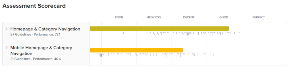
Audit UX de Nike : synthèse
In general, Nike’s website is quite good and can serve as an example of a well-designed online store. Navigation is intuitive, and the website is clear and thorough. The category tree is structured correctly and consistently, apart from a few minor issues that could definitely be improved. However, they are not so serious as to underestimate the overall result of the UX analysis.
The examples presented above show how important it is for an online store to follow the guidelines and good UX practices. If you are interested in implementing UX-oriented ecommerce tools and solutions that will support your customers’ purchasing decisions and help you stand out from the competition, check our offrir.
A UX audit is a structured evaluation of a website’s usability, identifying friction points that prevent users from completing their intended actions. In ecommerce, poor UX directly affects conversion rates and revenue. An audit provides a systematic basis for improvement decisions rather than relying on intuition.
Zara’s main issues included auto-scrolling carousels without a hover-stop function, a category structure with 14+ subcategories that creates navigation friction, confusing industry terminology that may not match how customers think about products, poor text-image contrast, and slow load time (Largest Contentful Paint of 3.8 seconds). Visual appeal was strong, but it came at the expense of usability.
Nike demonstrated stronger UX overall, with a cleaner navigation structure, non-auto-scrolling carousels with visible controls, proper filter implementation, and clearer category hierarchies. Its weaknesses included hidden mobile carousel controls, a geolocation selector placed in the footer rather than the header, and slow performance with an LCP of 5 seconds.
The most common issues are overly complex category taxonomies, auto-scrolling content that removes user control, brand-specific terminology that does not match how customers search, inconsistent category naming across pages, and performance issues that increase bounce rates. Each of these reduces the likelihood that a visitor finds what they came for.
Largest Contentful Paint (LCP), which measures when the main content of a page becomes visible, should be under 2.5 seconds for a good user experience. Both Zara (3.8 seconds) and Nike (5 seconds) fell below this threshold. Slow load times increase abandonment, particularly on mobile, where users have less tolerance for waiting.


arrow_circle_rightContactez-nous
Besoin d'aide pour concevoir des produits ecommerce ? Contactez notre expert

arrow_circle_right Nos articles